Elements and layout
A screen is a tree of elements, rebuilt every frame from your state. You style elements with chained builders, Taffy lays them out with flexbox, grid or absolute positioning, and the engine paints them.
use anvil_ui::{div, icon, text, Icon, Tok};

ui.element(area, div()
    .p_4().gap_3()
    .bg(Tok::Card).rounded_lg().border_1()
    .child(div().flex_row().items_center().justify_between()
        .child(text("Battery").heading())
        .child(text("94%").color(Tok::Success)))
    .child(text("Paragraphs wrap to the width they are given.").body()));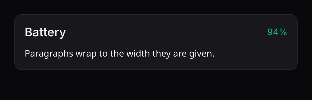
The five kinds
| Constructor | What it is |
|---|---|
div() | A container. Children stack in a column unless .flex_row(). |
text("…") | Text: 15 px Inter, wrapping to the width it gets. Its size and color inherit from its parents. |
icon(Icon::Plus) | An icon from the built-in set, 20 px, in the inherited text color. |
img(texture) | A picture uploaded with renderer.upload(&frame). Covers its box by default; .fit(Fit::Contain) to show all of it. |
canvas(|ui, r| …) | Your own drawing with ordinary Ui calls inside the rectangle layout gives it. This is how immediate-mode widgets (a text field, a chart) sit in a tree. Give it a size or .flex_1(): it has no content to measure. |
Building the tree
.child(el)adds one child,.children(iter)many (any iterator of elements)..id(id)names an element. Anything with state (hover blend, scroll offset, entrance) keys it by id. Without one, an element is keyed by its parent and its place among its siblings, so give list items an id:.id(ElementId::new("row").key(item.id)).ui.element(area, tree)lays the tree out insidearea(physical px), runs this frame's input through it, and paints it. The root fills the area's width; its height follows its content unless you set one.ui.layout_element(area, &tree)lays out without painting or input, and returns every element's rectangle (LaidOut::rects, in tree order). Useful for tests.
Units
Every length you write is in logical pixels (ADL points). The engine multiplies
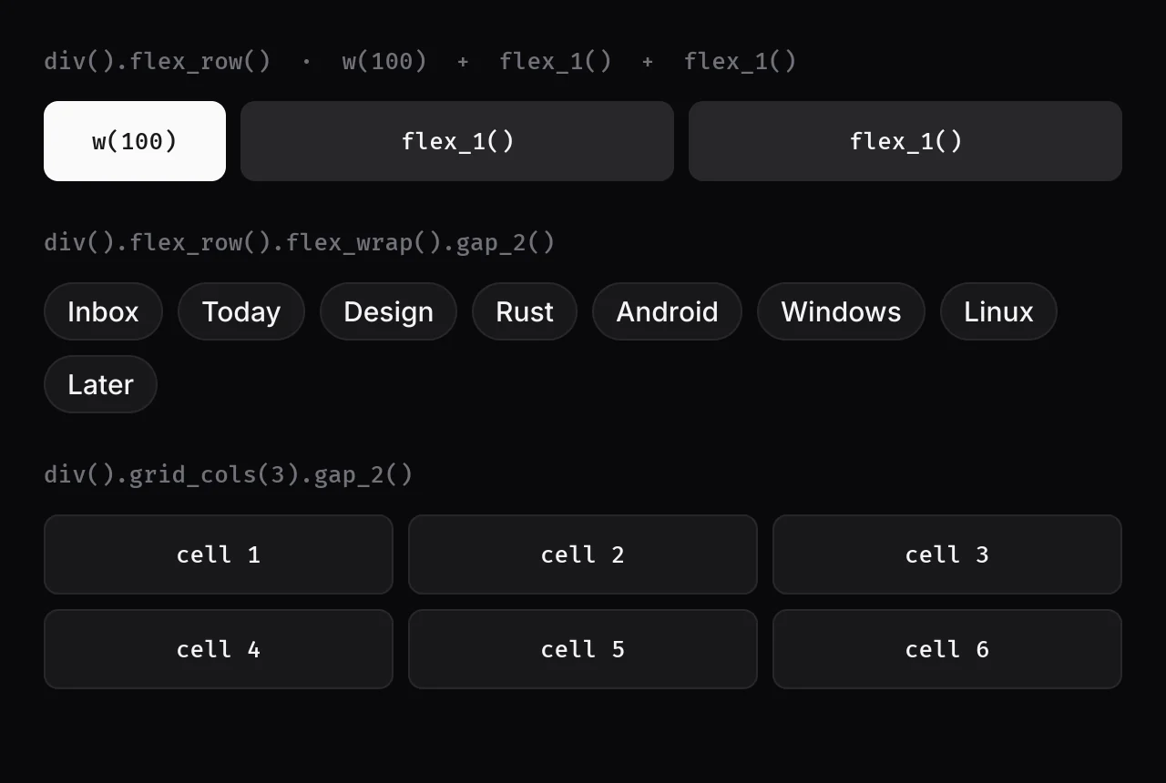
by the display's scale factor once, so .w(100.0) is 100 px on a standard display and
200 px on a 2x one. Spacing follows ADL's 4 px steps: gap_1 is 4, p_4 is
16, gap_8 is 32.
Layout builders
| Builder | Effect |
|---|---|
flex_row(), flex_col() | Lay children out in a row or a column (the default). |
flex_wrap() | Let children flow onto more lines, like a row of chips. |
grid_cols(n), col_span(n) | A grid of n equal columns; a child spanning n columns. |
items_start/center/end/stretch/baseline() | Cross-axis alignment of children. |
self_center() | Center this element on its parent's cross axis. |
justify_start/center/end/between/around() | Main-axis distribution of children. |
gap(px), gap_x, gap_y, gap_1..8 | Space between children. |
p(px), px, py, pt, pb, p_1..8, px_2..4, py_1..4 | Padding. |
m(px), mt(px) | Margin. |
w(px), h(px), size(px) | A fixed size (ADL "Fixed"). |
w_full(), h_full(), w_frac(f) | A fraction of the parent. |
min_w, max_w, min_h, max_h | Limits. |
flex_1() | Take a share of the free space, starting from zero (ADL "Fill"). |
grow(weight), shrink_0() | Grow from content size; never shrink below content. |
absolute() with top/right/bottom/left(px) | Take the element out of the flow and pin it to the parent's edges, like a badge. |
hidden() | Lay out as if absent. |
scroll() | A vertical scroll container. See Scrolling. |
An element with no size hugs its content (ADL "Hug"). Text measures itself: its widest word is the narrowest it can be, and it wraps to the width it is given.
Paint builders
| Builder | Effect |
|---|---|
bg(paint) | Background: a theme token such as Tok::Card, or a fixed color [r, g, b, a]. |
border_1(), border_color(paint) | A 1 px border in Tok::Border by default. It takes layout space, like CSS. |
rounded(px), rounded_sm/md/lg/full() | Corner radius; the named ones follow the theme (4, 8, 12, pill). |
shadow() | The overlay shadow, for floating surfaces only. |
glass() | Blurred, tinted glass. Only on a floating layer (see Glass). |
opacity(a) | Fades the element and everything inside it. |
overflow_hidden() | Clip children (drawing and the pointer) to this element. |
Text builders
| Builder | Effect |
|---|---|
color(paint) | On text or an icon, its own color; on a div, inherited by everything inside. |
text_size(px) | On text, its size; on an icon, its size; on a div, inherited. |
body() | Paragraph text: 15 px Noto Sans on a 1.5 line. |
heading(), title() | 20 px Medium; 26 px SemiBold. |
caption(), label() | 13 px in Tok::Muted; 13 px Medium muted, for field labels. |
medium(), semibold(), italic(), mono() | Weight, style and the monospace font. |
nowrap() | One line, ending in an ellipsis if it does not fit. |
Theme tokens
Use tokens, not fixed colors, and a theme change recolors the whole tree with no rebuild. The
tokens are Tok::Bg, Sunken, Surface, Card,
CardHi, Border, Ring, Text,
TextDim, Muted, Disabled, DisabledBg,
Primary, PrimaryFg, OnColor, Selection,
Code, Success, Warning and Danger. See
Design system.
Mixing in immediate-mode code
canvas is the bridge between the two ways of building UI. Inside it you have the
full Ui and the rectangle layout chose:
let chart = canvas(move |ui: &mut Ui, r: Rect| {
    ui.progress_ring(r.center(), r.w() * 0.4, ui.s(6.0), 0.72, ui.theme().primary);
})
.size(96.0);
The other way round works too: call ui.element(rect, tree) anywhere in immediate-mode
code to lay out a tree inside a rectangle you computed.