Interaction
Elements carry the messages they send. The engine finds what the pointer is over, handles focus and the keyboard, scrolls, recognizes gestures, and animates state changes. Your app only reads the messages after the frame.
Actions
An action is any value your app defines, usually a message enum. Attach it to an element; read what fired after the frame:
ui.element(area, div()
    .p_3().rounded_md()
    .hover(|s| s.bg(Tok::CardHi)).transition(motion::INSTANT)
    .on_click(Msg::Open(id))
    .child(text(title)));

for msg in ui.take_actions::<Msg>() {
    app.update(msg);
}| Builder | Fires when |
|---|---|
on_click(a) | A press and release inside the element, or Enter / Space while it has keyboard focus. Makes it focusable. |
on_double_click(a) | The second of two quick taps (350 ms). The first still clicks. |
on_long_press(a) | A press held still for 500 ms. Its release does not click. |
on_click_outside(a) | A press anywhere outside the element: menus and popovers close with it. |
on_escape(a) | Escape, when focus is inside the element or nothing nearer handles it. |
on_drag(|d| …) | Each step of a drag that started on the element, with its axis locked after 8 px. A drag the element takes never clicks. |
on_swipe(|dir| …) | A fast flick that started on the element (500 px/s). |
Actions of other types are left for their own take_actions, so a screen and a
component can use different message types in the same frame.
Bubbling
An event goes to the topmost element under the pointer, then up through its ancestors. The first one with a handler for it fires, and the event stops there. So a delete button inside a clickable row deletes without also opening the row.
.bubble()lets an event an element handled go on to its ancestors as well..stop_propagation()stops events at an element that has no handler of its own..disabled(true)greys the element and everything inside it out, and swallows its input.
Hit testing respects clips, scroll containers and open modals, and on touch screens anything with a pointer handler gets a hit box of at least 48 dp, without changing how it looks.
Hover, press and focus styles
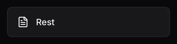
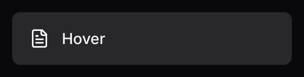
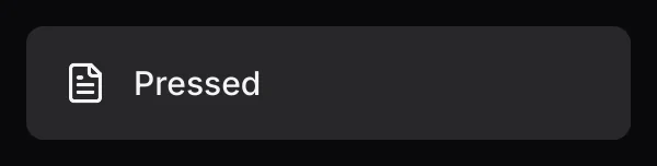
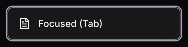
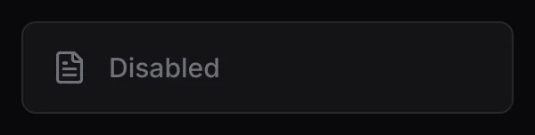
The same row in each state, from one row() function, with input driven by the engine.
State styles change paint only (background, border, text color, opacity), so they never cause
layout to move. .transition(seconds) blends them:
div()
    .bg(Tok::Card).border_1()
    .hover(|s| s.bg(Tok::CardHi))
    .active(|s| s.bg(Tok::Border))
    .focus(|s| s.border_color(Tok::Ring))
    .transition(motion::INSTANT)
Use the ADL motion tokens: motion::INSTANT (90 ms) for hover and press,
motion::FAST (160 ms) for focus. A .hover applies while the pointer is over
the element or anything inside it.
Keyboard and focus
- Anything with
on_clickjoins the Tab order, in tree order..focusable(true)adds anything else;.focusable(false)takes a clickable element out. - Tab and Shift+Tab move focus and show the focus ring. Enter or Space clicks the focused element.
- Escape goes to the nearest
on_escapearound focus, or else to the innermost one on screen. - While a modal is open (
ui.begin_modal), Tab and Escape stay inside it. - A press focuses what it lands on without showing the ring, so Tab continues from there.
Scrolling
.scroll() makes a vertical scroll container. Give it a height (or .flex_1()
in a column with a height) and an id:
div()
    .id("inbox")
    .scroll()
    .flex_1()
    .gap_2()
    .children(messages.iter().map(row))
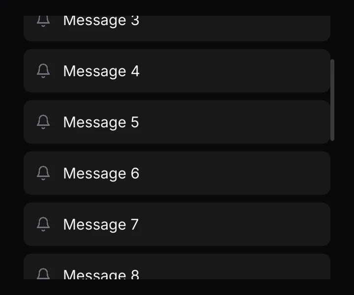
It scrolls with the wheel, a drag and touch fling, with a rubber band at the ends and a scroll thumb. Only the innermost container under the pointer takes input. Its children keep their own height instead of squeezing to fit. A press that scrolled never also clicks the row it started on.
Gestures
One recognizer serves the whole app with the same thresholds everywhere: tap, double tap (350 ms), long press (500 ms), drag with an axis lock after 8 px, and swipe (500 px/s). Elements use it through the actions above. Immediate-mode code can read this frame's gestures directly:
use anvil_ui::gesture::{Gesture, Phase};

for g in ui.gestures() {
    if let Gesture::Drag(d) = g {
        if d.phase == Phase::Move {
            offset += d.delta;
        }
    }
}
Entrances and transitions
.enter(Enter::Rise)fades the element in while it rises 8 px, the first time it is shown.Enter::Fadeonly fades..enter_at(Enter::Rise, index)delays it byindexstagger steps (40 ms each, at most five), for lists. Give list items ids so each plays once.- Motion is skipped when the user has asked for reduced motion (
ui.set_reduced_motion(true)).
For anything else that moves, ui.animate, ui.spring and
ui.presence are covered in Motion.