Widgets
Alongside elements, Ui has a complete set of immediate-mode widgets.
You call one with an id and a rectangle, and it draws itself and returns what happened. They
follow ADL (sizes, states, motion, focus rings) and work with touch and keyboard.
if ui.button("save", Rect::new(x, y, 120.0, 40.0), "Save", Some(Icon::Check), ButtonVariant::Primary, true) {
    save(&doc);
}
ui.text_field("name", field_rect, &mut name, 64, InputKind::Text, "Your name", None);
if ui.toggle("sync", toggle_rect, sync_on) {
    sync_on = !sync_on;
}
Rectangles are in physical pixels. Convert lengths you think of in logical pixels with
ui.s(px). Inside an element tree, put widgets in a canvas
and layout gives you the rectangle.
Ids
Every interactive widget takes an id: a string literal, or an ElementId for things in
a list (ElementId::new("row").key(&item.id)). The id keys its animation, focus and
text-editing state, so it must be unique on screen and stable across frames.
Controls
| Widget | Signature and result |
|---|---|
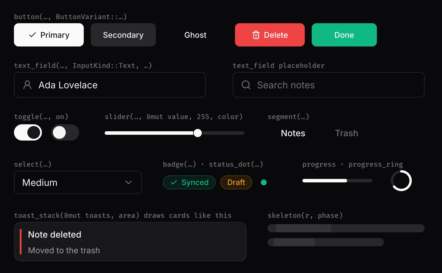
| Button | button(id, r, label, icon: Option<Icon>, variant: ButtonVariant, enabled) -> bool (clicked). Variants: Primary, Secondary, Ghost, Destructive, Success. |
| Text field | text_field(id, r, &mut String, max_len, kind: InputKind, placeholder, icon). Kinds: Text, Alnum, Password, Email, Number { min, max, decimals }. Click to place the caret, Shift and arrow keys or a drag to select, Ctrl+A/C/X/V. |
| Toggle | toggle(id, r, on) -> bool (flipped). |
| Slider | slider(id, r, &mut u8, max, color) -> bool (changed). dual_range(id, r, &mut lo, &mut hi, max) for a range. |
| Select | select(id, r, items: &[&str], &mut selected, &mut open) -> bool. The menu draws above everything in ui.end(). popup_list(id, anchor, width, items, &mut selected, &mut open) for a menu from any anchor. |
| Tabs | tab(id, r, icon, label, TabState) -> bool; segment(id, r, label, active) -> bool; tab_bar(ids, close_ids, r, labels, &mut active) -> Option<usize> (a tab to close). |
| Chips and tags | tag_chips(ids, r, &tags) -> Option<usize>; badge(r, icon, label, color) with badge_width(has_icon, label); status_dot(center, radius, color). |
| Navigation | breadcrumb(ids, r, parts) -> Option<usize>; pagination(prev_id, next_id, page_ids, r, &mut current, total); chevron_toggle(id, r, expanded) -> bool. |
| Pickers | date_grid(ids, r, grid: &[Option<u32>], &mut selected) -> bool; swatch_grid(ids, r, colors, &mut selected) -> bool. |
| Files | dropzone(id, r, active) -> bool. Dropped file paths arrive in Input::dropped. |
| Layout helpers | splitter(id, handle, span, &mut ratio, min, max) -> bool (a draggable pane divider); scrollbar(id, track, content, view, &mut offset) -> bool. |
Feedback
| Widget | Use |
|---|---|
| Toasts | Keep a Toasts in your state. toasts.push(title, message, color) or push_action(title, message, color, "Undo") -> id. Each frame call ui.toast_stack(&mut toasts, area) -> Option<u64>: it returns the toast whose action was clicked. Toasts stack, time out (3.2 s, 6 s with an action), pause on hover, and swipe away. |
| Tooltip | tooltip(id, anchor, text) after the control it describes. It shows after 500 ms of hover. |
| Progress | progress(r, fraction, color); progress_ring(center, radius, width, fraction, color); skeleton(r, phase) for loading placeholders. |
Modals, menus and layers
begin_modal(panel)…end_modal(): dims the window and lets onlypaneltake the pointer, Tab and Escape. Callblock_background_for_modal(panel)at the start of the frame too, so nothing behind reacts on the frame it opens.begin_floating(r)…end_floating(): draw on the floating layer (above content, below modals). Glass needs a floating layer.set_layer(0..=2): base, floating and top. Later layers draw over earlier ones whatever the call order.pointer_modal(area)andpointer_overlay(area): restrict or reserve the pointer from the next frame, for overlays you draw yourself.
Mobile controls
| Widget | Use |
|---|---|
| Bottom navigation | bottom_nav(ids, r, &[NavItem { icon, label, primary }], active) -> Option<usize>. One item may be primary: a raised round action. |
| Toolbar button | toolbar_button(id, r, icon, enabled, on) -> bool, sized for thumbs. |
| Swipe row | swipe_row(id, r, threshold) -> Swipe { offset, progress, committed }: draw the row at offset, reveal an action by progress, act on committed. |
| Back swipe | back_swipe() -> bool: a swipe in from the left edge. |
Drawing primitives
For everything else, draw directly. All take physical pixels:
rect(r, RectStyle::fill(color).radius(px).border(color, width)), with.linear(to, angle)and.radial(to)gradients and.soft(px)for blurred edges.card(r),surface(r),shadow(r, radius),divider(x, y, w).text(x, y, content, style) -> width,text_fit(ellipsized to a width),text_wrapped,text_center. See Text.icon(r, Icon, tint),image(r, texture, Fit, radius).stroke_line(a, b, width, color),polyline(points, width, color),stroke(&path, width, color),arc(center, radius, start, sweep, width, color).push_clip(r)…pop_clip();set_opacity(a) -> previous.
Reading input yourself
click_region(id, r) -> bool and hover_amount(id, r) -> 0..1 make anything
clickable. pointer(), key_pressed(UiKey), scroll_in(r),
secondary_in(r), drag_delta(id, hit), is_focused(id) and
pressed_outside(&areas) read this frame's input.